GoTu Schedule
PROBLEM & OBJECTIVES
The schedule section of the app and website were facing two major UX challenges. First, sections would appear and disappear dynamically based on whether or not there was information in certain categories, causing confusion for users who may not always know what information is missing or why sections are not visible. This behavior led to frustration when trying to locate specific details quickly. Secondly, there was inconsistency in the terminology used across the schedule, which created additional confusion and made the interface less intuitive. Addressing these issues by providing clearer, consistent language and ensuring a more predictable layout was the plan to improve the overall user experience and made the products easier to navigate. Additionally, we were going enhance the calendar to make it more actionable, simplifying other processes within the product to streamline the user experience and increase overall efficiency.
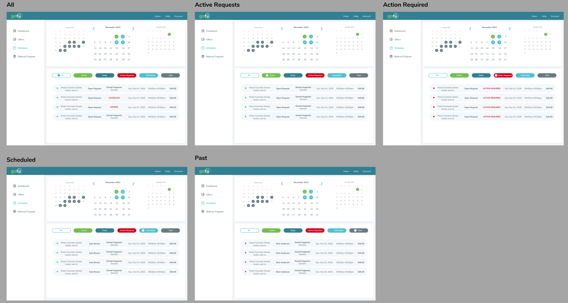
OLD SCHEDULE - Website
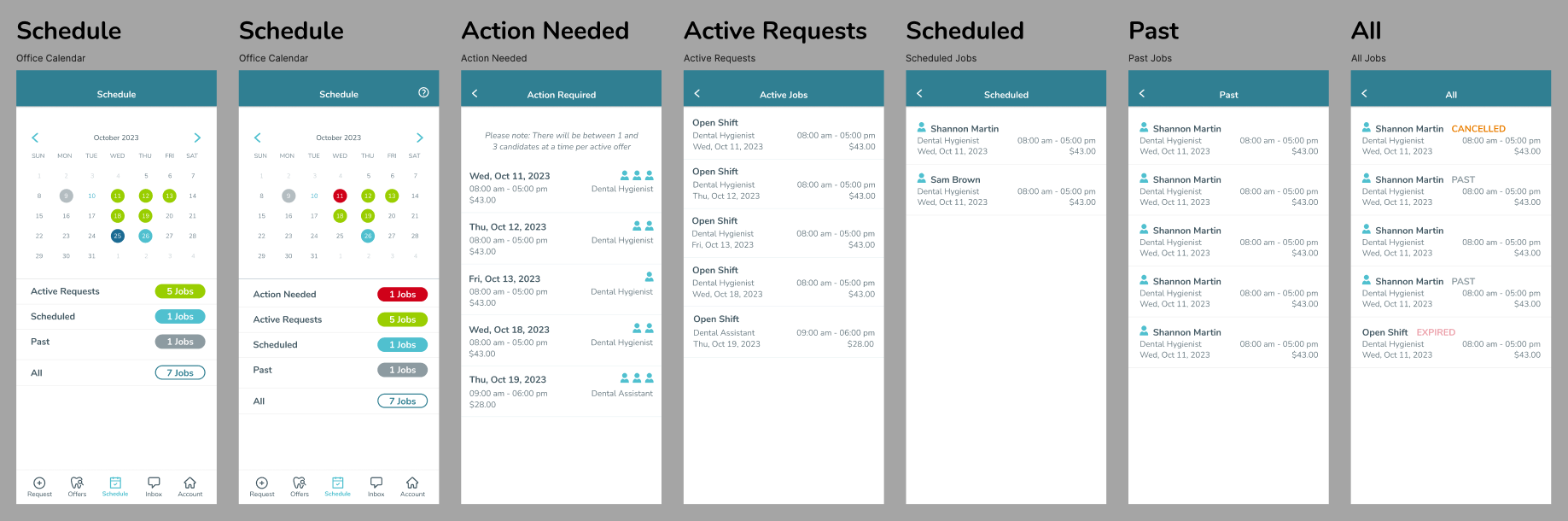
OLD SCHEDULE - App
At first glance, I identified several issues that I knew would quickly help alleviate some of the users' pain points:
1. Sections like "Action Needed" and "Today" would unpredictably appear and disappear.
2. There was inconsistency in the terminology used throughout the products, website and app. For example, "Action Needed" was also referred as "Action Required", and "Active Requests" were referred to by various terms like "Active Jobs", "Open Shifts", "Active" and "Open Requests".
3. There was inconsistency in the colors used to represent different categories and statuses across products, such as different shades of green or grey, and entirely different colors for "Cancelled" and "Expired".
RESEARCH & FINDINGS
I aimed not only to enhance the design of the Schedule but also to add value by introducing features that would streamline as many processes as possible.To achieve this, we conducted several interviews to gain a deeper understanding of the offices' needs and how we could improve access to key functions without requiring users to leave the Schedule section.
Based on the feedback from users, they highlighted the following needs:
1. The ability to request a professional on days when no one was scheduled.
2. A feature to share unfilled shifts (Open Shifts) with others.
3. The option to track how many professionals have applied to their "Action Needed" shifts, similar to how is displayed in the app.
4. The ability to view which professionals were scheduled to come into the office.
COMPETITIVE ANALISYS
I conducted research to identify the scheduling software commonly used dental offices and what office managers were most familiar with. I gathered screenshots from Dentrix, Eaglesoft, Dentech and ClearDent.
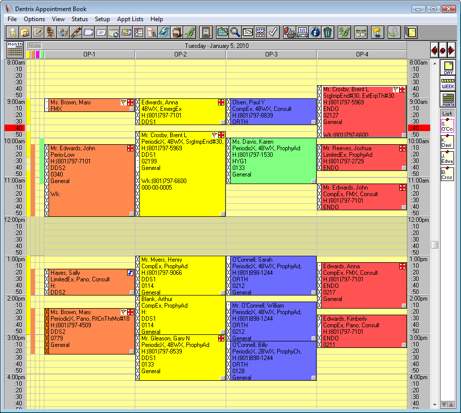
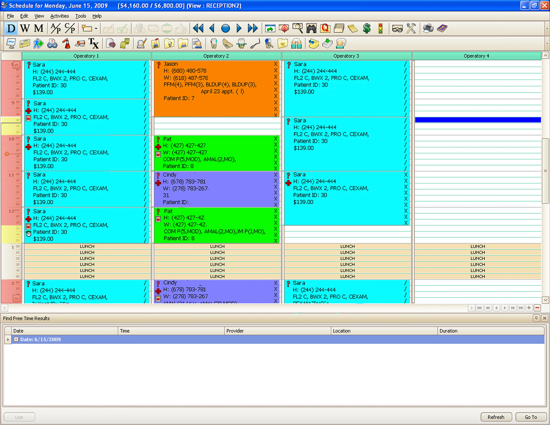
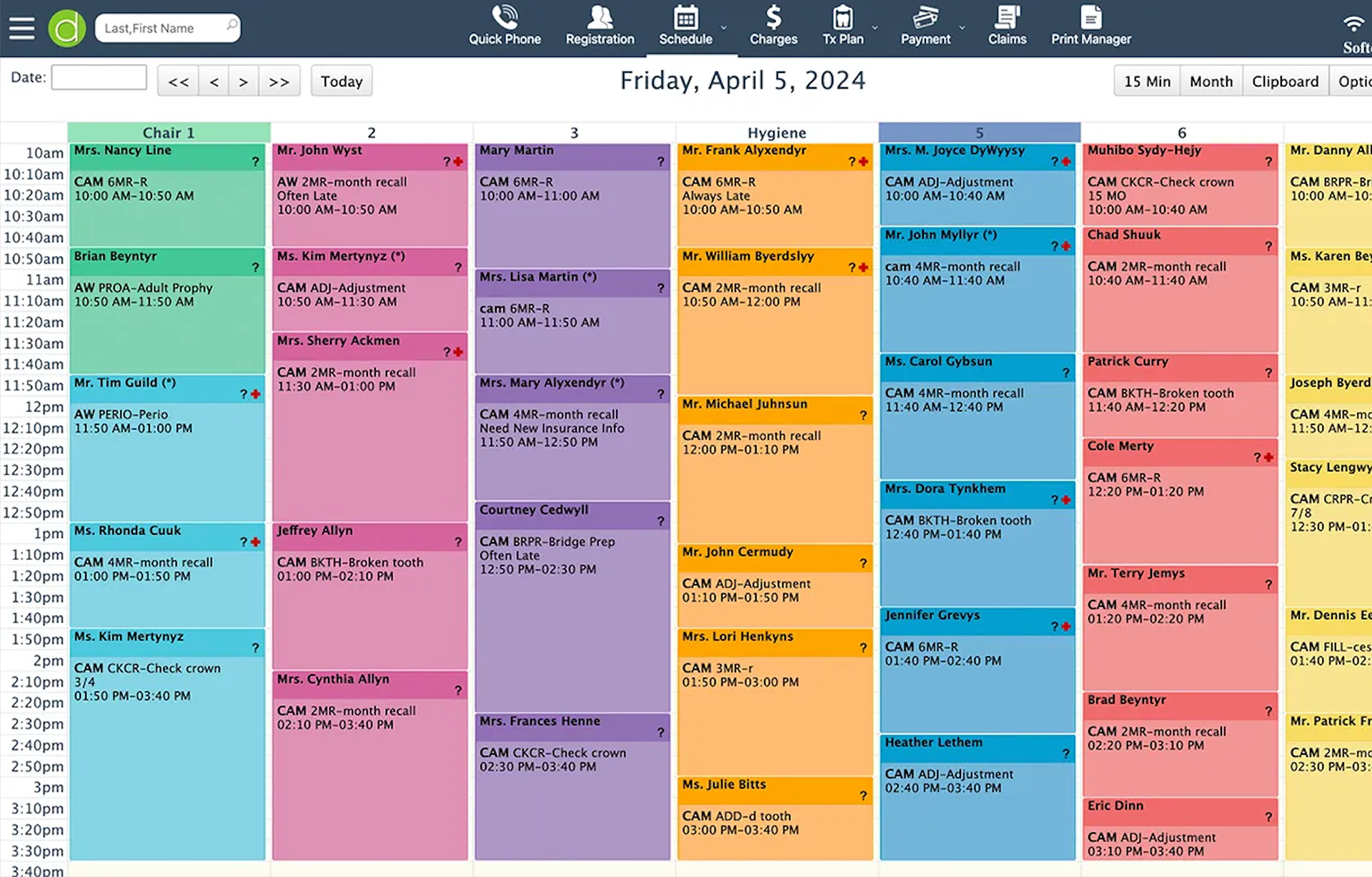
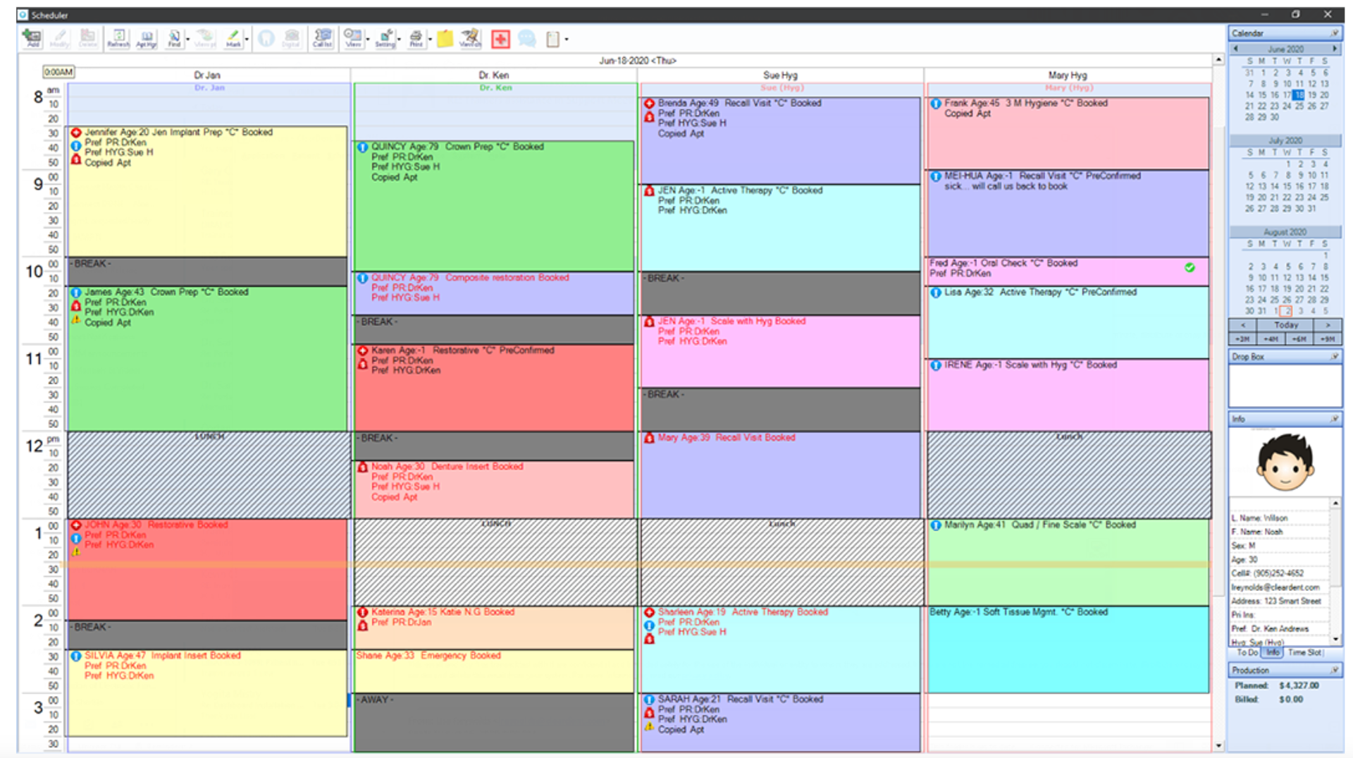
One thing that stood out to me immediately was the use of color coding. These platforms utilized bright, distinctive colors to clearly differentiate between various procedures, days, or statuses. The color coding was highly informative, and everything was organized in a large calendar format, similar to an agenda.
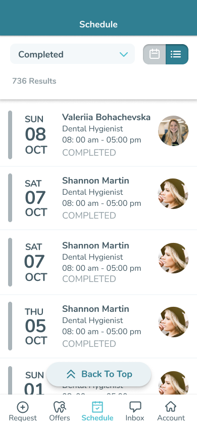
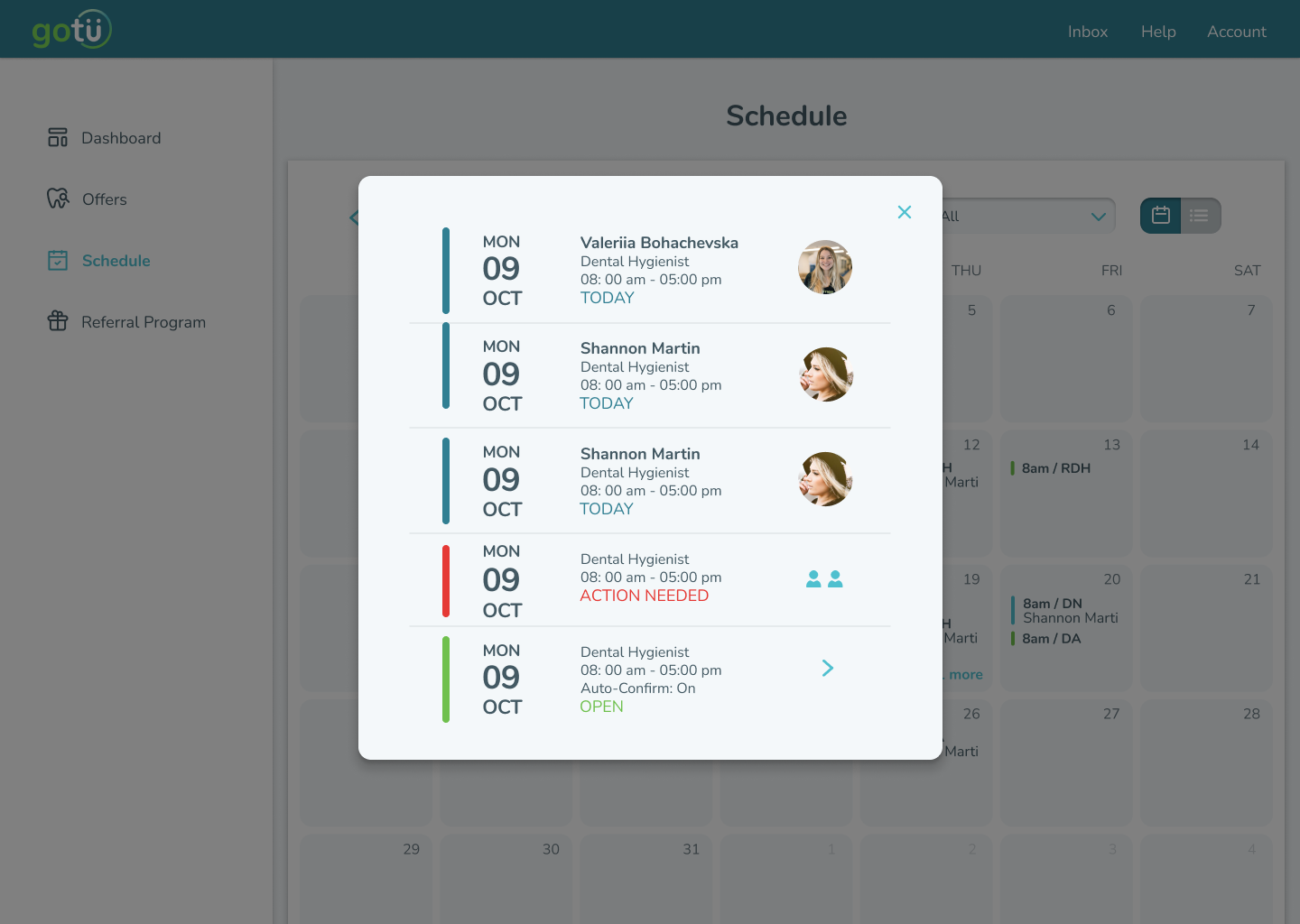
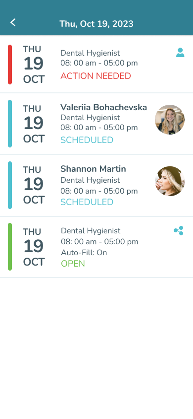
FINAL PRODUCT
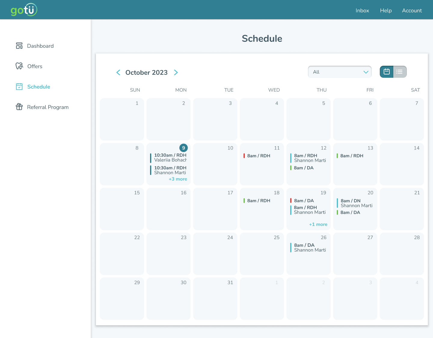
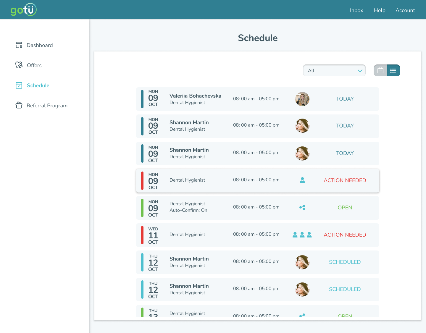
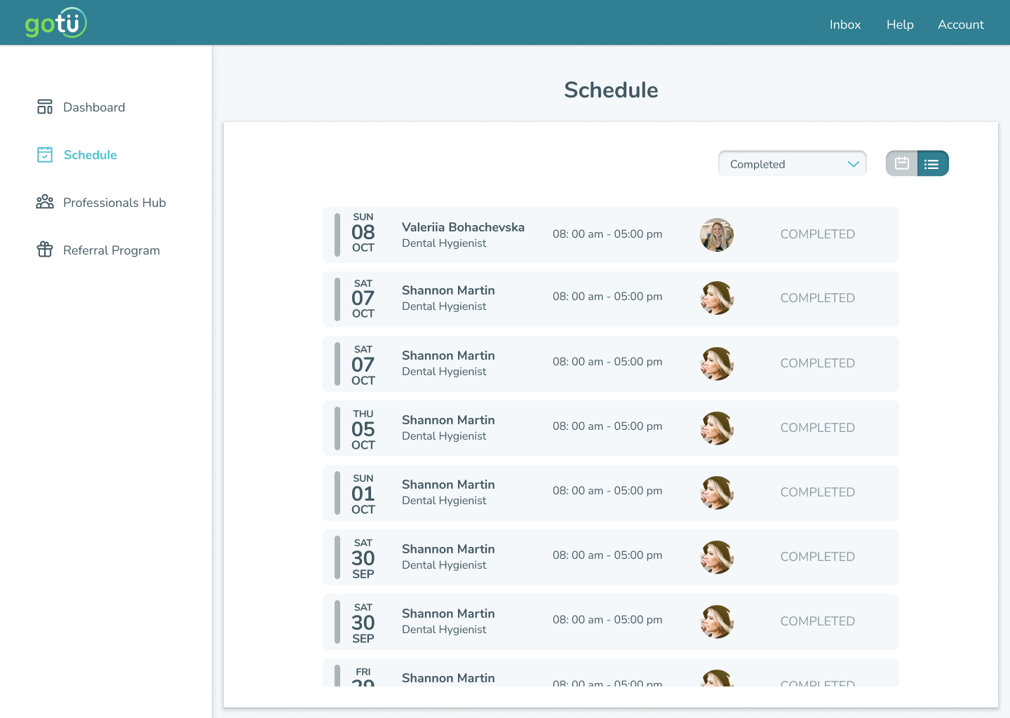
Website - Calendar View, List View.
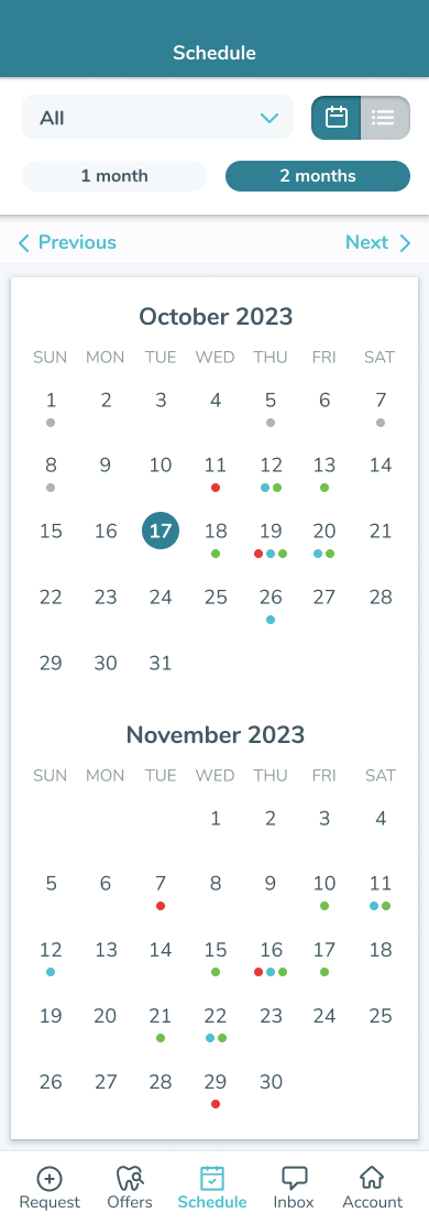
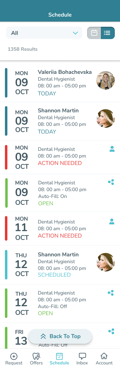
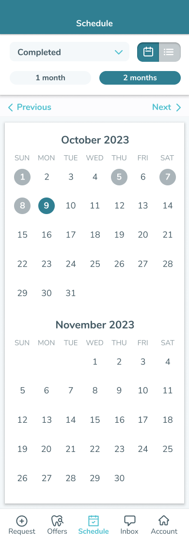
App - Calendar View, List View.
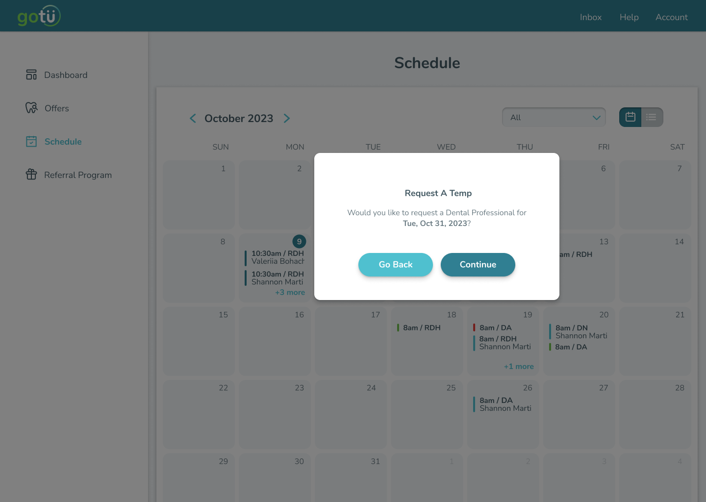
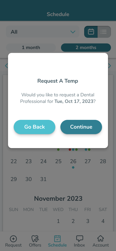
There were a few technical challenges during implementation, but we successfully met the objectives in the final result. Colors and terminology were made consistent across both the website and app while maintaining the design style of the GoTu brand . We opted for a two-view design: a full-screen calendar view, similar to an agenda, and a list view that incorporated all the functions requested by users. Users can now share "Open" shifts with professionals from their Favorites list, see how many professionals have applied to their "Action Needed" shifts, and view who is scheduled to come into the office, either on the current day or in the future. Additionally, we added the ability to request a professional for any empty days on their schedule.
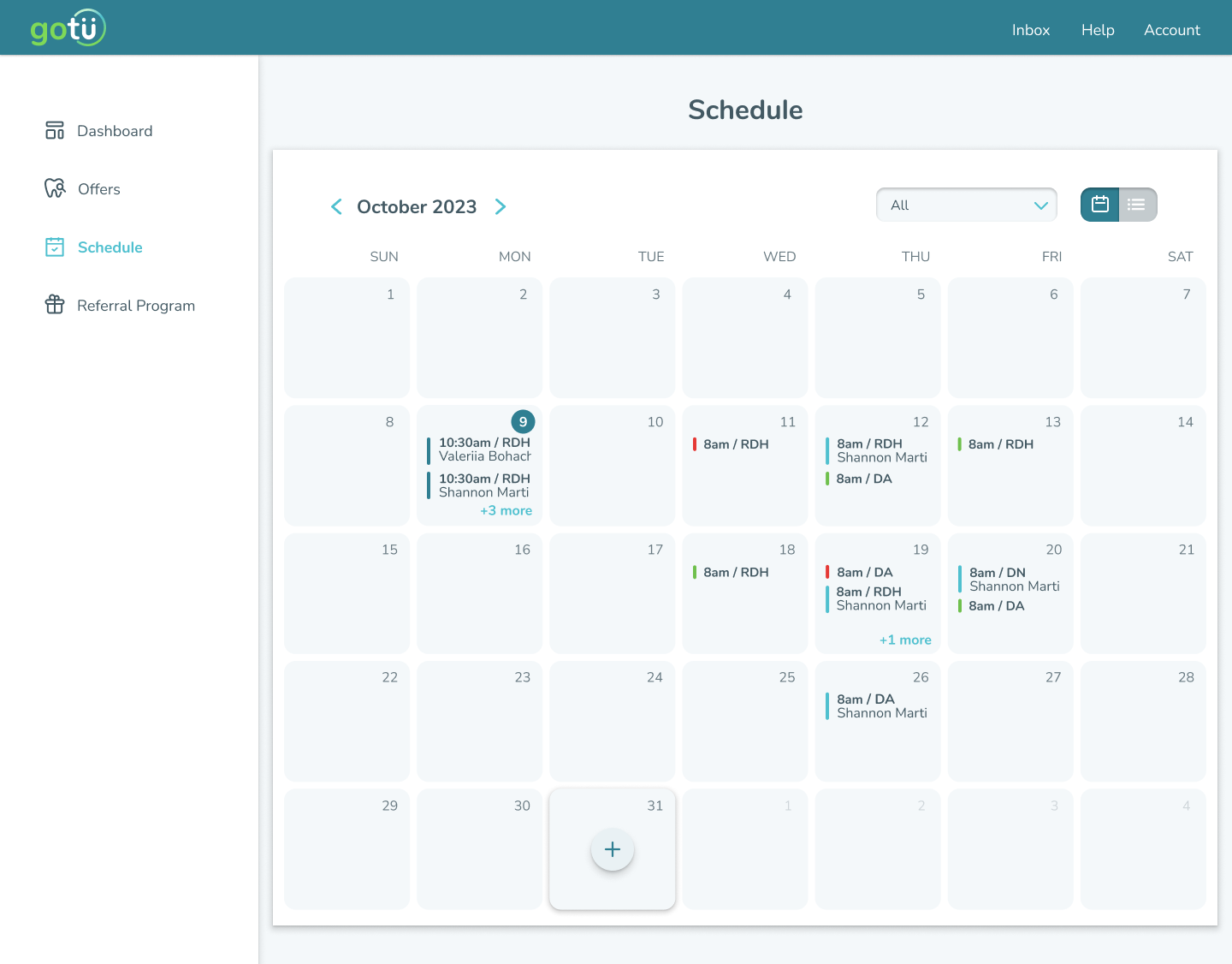
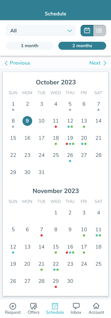
To maximize the use of space, we also incorporated a dropdown filter, allowing users to easily select and navigate the specific category of shifts they are looking for.
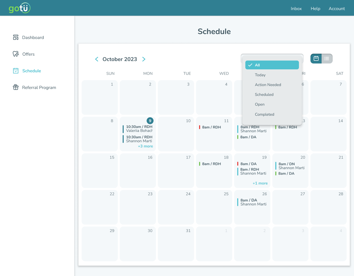
Here's how the selected category is displayed in both the calendar and list views.
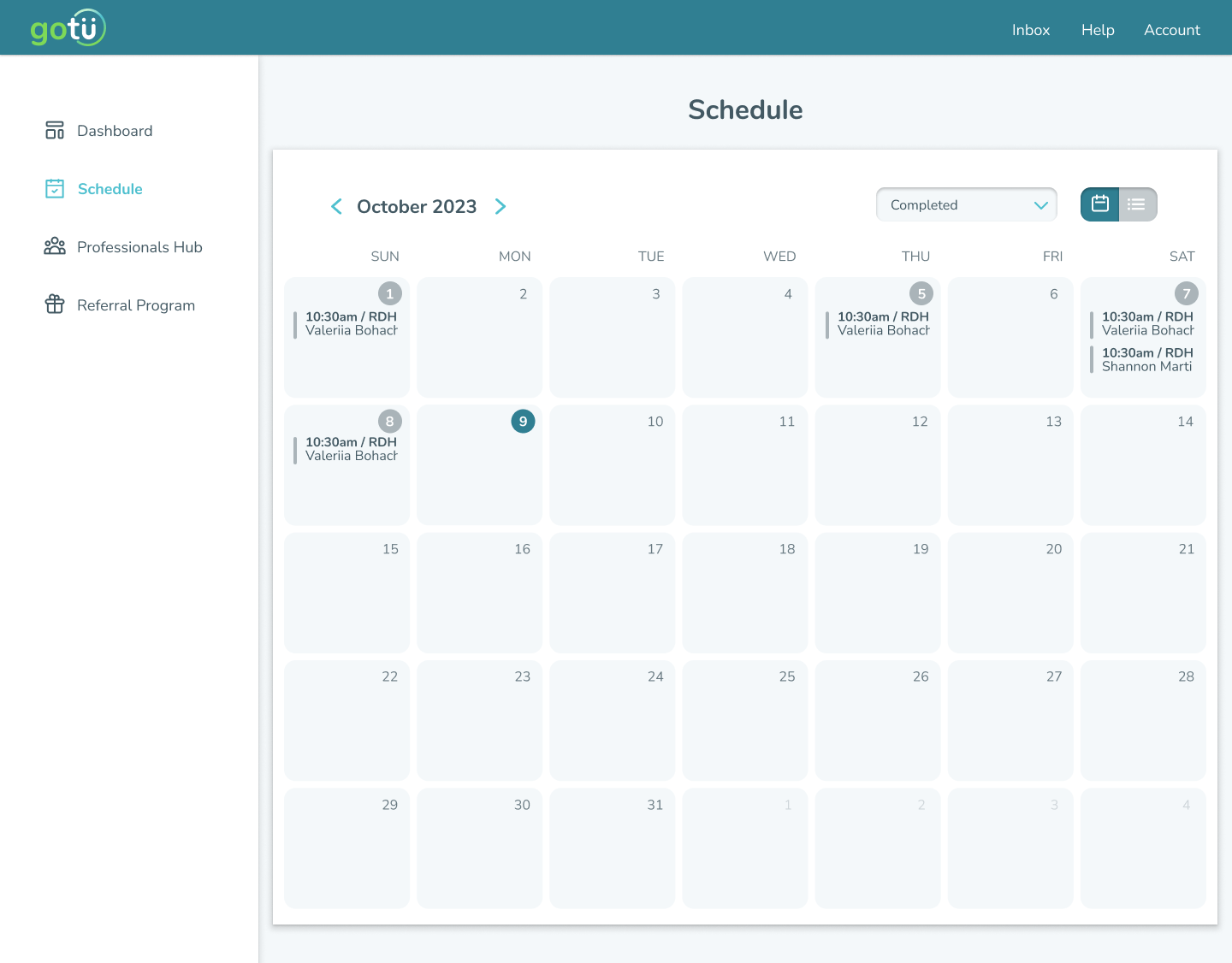
When a day is selected in the calendar view, the cell expands to display more details about the events of that day. In the app version, a separate screen opens to provide this information.
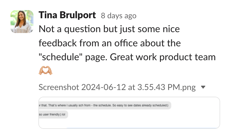
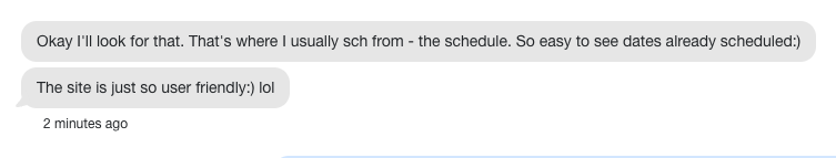
REVIEWS
Users were very pleased with the changes, and other teams were excited about the positive feedback they were receiving regarding the Schedule section.